Paul Eis - Mixed Architecture
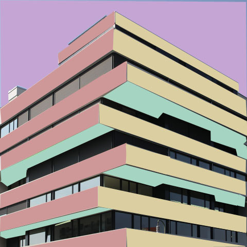
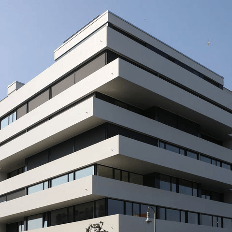
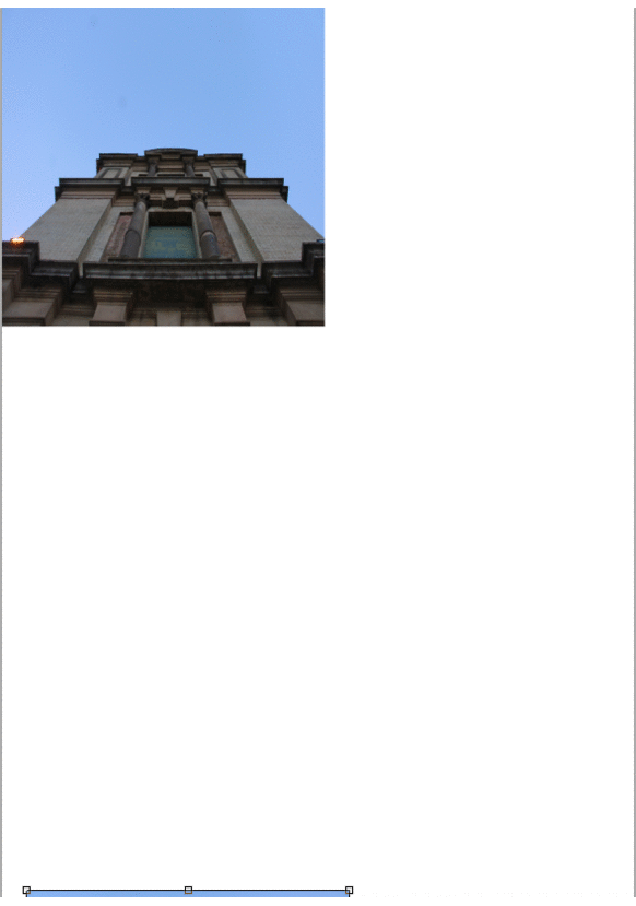
This time, we used the skills we learnt in simplified images and used them to appropriately make an image semi realistic, we did this to mirror Paul Eis' work. I used the different colours on this image but I used them on the same shades. Paul Eis was born in Berlin in 1998. There he attended the humanistic school "Gymnasium Steglitz", which he graduated from in 2016. In the same year, he moved to Linz, Austria. Since then he has been studying architecture at the University of Art in Linz. In addition to his studies, he works for various architecture firms in Austria and abroad. Paul Eis has been working internationally as an architectural photographer since 2015. His work is at the intersection of photography, architecture and art. The project "a colourful makeover of architecture" attracted a lot of international attention. With more than 40,000 followers, it was repeatedly ranked by the press as one of the most important architecture channels on Instagram. In addition, the project was published by many renowned magazines such as Dezeen, Business Insider or Architectural Digest. The television broadcaster Deutsche Welle produced a television feature on Paul Eis in 2019. Most recently, "a colourful makeover of architecture" was part of various exhibitions, including in the USA and in Venice as part of the 2021 Architecture Biennale.


My Work:
|
|
In this collection you can see many images of modern architecture. However, I used the polygonal tool to show Paul Eis' work to the viewer by shading the most prominent colours to emphasise pastels and contrast within architecture. To do this, i would open the image on to photoshop and use the polygonal tool to select the areas i wanted to colour. I would then fill the colour with a block colour and then flatten the image again. Later, when i had the final outcome i created the top GIF with gifmaker and chose a slower speed so that the viewer could truly understand the contrast. I did really like this piece, mostly because it was neat and coordinated. It wasn't at all messy or disorganised, it was very structured and i found that inreally liked mixing photography and architecture, especially to enhance certain features of the architecture. one thing i would do differently is would be to use more vibrant neon colours to make my images stand out.
Looking up: Homework
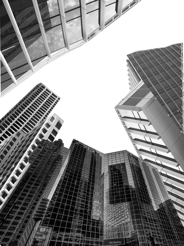
Andy Yeung
Andy Yeung is a photographer who focuses on landscape photography, architecture, and travel. Born and raised in Hong Kong, his main aim is to make people view cities in a new perspective and to 'look up' with fresh eyes. His focus on this type of photography came after his realisation of repetitive geometric patterns in buildings around him.


Our homework piece was to experiment with his techniques such as looking up and down as well as focusing in on one par of architecture. I did this at Alexandra Palace. I went back over his work and saw that he not only focused on the buildings but also the weather and the lighting in his work. Because of this, I took pictures at sunset so that I could experiment with the angles and lighting of my pictures.
In this collection of images you can see different views of Alexandra Palace, these images were taken at sunset so the lightning was really warm which meant that you had an ombre of lighting, at one end of the spectrum there was a darker element to the picture and when you moved to the right you could see a warmer version, it also added definition to many unnoticed features which i thought was really fascinating. I liked that these pictures had natural sunlight and that they had a lot of brightness because it meant that some parts of the architecture of the building were enhanced. What I would do next time would be to take pictures on a tripod so that the pictures were more focused and were at an equal angle at the base.
Composition
Rule of thirds:
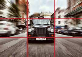
The rule of thirds is a guideline that allows you to place a subject between the left or right third of an image. This is done by splitting the image into nine equal parts, three equally horizontal lines and three equally vertical lines. This guideline is used amongst many photographers as it draws the viewers eye into the image as well as emphasising the subject.
Layers:

Layering is a technique that uses foreground (the layer which is closest to the ground), the subject and various backgrounds behind it. This technique is important because it tells a comprehensive story.
Triangles:

Triangles are a good way of creating stability in an image because they group elements together. However, if you want to create an unstable image in photography, you could use an upside down triangle to show how hectic an image is.
Rule of Three:

The rule of thirds is a rule intended to make your image more aesthetically pleasing. It is a grid that breaks your image up into thirds, and placing the subject of the image on the horizontal or vertical lines will make it more aesthetically pleasing.
Reflection:
|
|
Through photoshop, we learnt how to reflect an image. We did this to mimic Andy Yeung's images of architecture and landscape photography. However, Andy Yeung did not reflect these images in photoshop, he took the images like this to allow us to view it in a different perspective. Firstly, we had to load our image (but edited for a better effect), and then open a new page of A3 International paper to allow us to reflect the image without using too much attention to detail. Then, we had to select our image and copy and paste it into our A3 sheet. Using Windows (command) T, we were able to resize the image. Doing this four times to accentuate the reflection you would normally get in a reflection with two images, we right clicked and there were options to flip horizontally and vertically, this allowed for a simpler construction.
|


With screenshots we were able to put this into GIFs:
I liked that the images were not out of place and were precisely reflected, yet in some of the images there is a blank line between half of the reflection. Next time, I would crop the image so that there was an equal length along the A3 sheet between the right and left side and no white line in the middle.
Framing the environment
John Divola
John Divola is an American contemporary visual artist. Today's tasks aim to make us look closer and create more interesting compositions within our work. In the 1970s, Los Angeles photographer John Divola began photographing in abandoned, often dilapidated houses. With his series Vandalism (1973–75) and Zuma (1977–78), however, he didn’t just photograph houses. Here, Divola describes how he manipulated the environments with painting and other interventions as a way of “vandalizing the tradition of photography.”


School Work:
For this task, we had to take a faraway image and then take an unexpected close up of a part of the faraway image. We had to do this with a white frame to mirror John Divola's work. For this, I used small details. For example, in the stairway picture there was a small snack packet. I took an image of this with the frame because it was such an unexpected close up. Although, I didn't like some of the images, such as the chair and the two door pictures. I thought these were too dark and the images weren't focused as well as being too slanted. I wasn't particularly happy with this piece as I thought that it didn't capture John Divola's intention of purposefully vandalised property. As well as this, I found that holding the frame as well as taking the picture at the same time was quite tricky. Looking back at this, I think that my pictures relate to more Romain Jacquet-Lagreze's work more than Divola's because of the fact that I felt like I was taking pictures of 'natural' vandalism rather than intentional vandalism.
I didn't like this collection of images because of the framing and the location. Next time, I would go and take pictures where there was intentional vandalism. I would have liked the images more if the camera was more focused and the frames were straight, as well as having more brightness.
Framing the environments after photoshopping:


In all of these edited images all of the frames were in the close up. I chose these six images to edit because even though they had a very low brightness before editing, they were the most focused and clear and they mirrored John Divola's work more than the others. These were the only images where the frames were in the close up and not in the faraway as well. Additionally, all of the frame sides were in the shot whereas some of the others didn't have all of the frame sides in it. Even though all of the frame was in the shot it would have been better if the frame was straight and not slanted.
Romain Jacquet-Lagreze:
Romain Jacquet-Lagreze is a french photographer who resides in Hong Kong. His Wild Concrete series was published in 2014, just two years after his first photobook: Vertical Horizon (2012). He started taking pictures for his photobook (Wild Concrete), after noticing trees growing in the bustling city, focusing solely on the phenomena of trees sprouting from residential buildings in Hong Kong, Wild Concrete compares living conditions of humans and plants.


Wild Concrete:
For this task we photographed our school, trying to find nature sprouting up from the infrastructure - just like Romain Jacquet-Lagreze did. We found many weeds in the cracks of the walls, as well as vines protruding from bins and old tin tubs. The most common plant was green ivy, we found this was different in comparison to Romain Jacquet-Lagreze's work, where he mainly found trees, we mostly found overgrown weeds and vines. I liked this collection of images because I believe that I properly captures Romain Jacquet-Lagreze's intended message. I would have preferred if the images had a higher saturation.
Layered Landscapes:
Fragments of a city, Anastasia Savinoe:
Anastasia Savinoe is a Russian born artist who currently lives in Sweden. She focuses on construction and building within the architectural building photography. In her mixed media piece, she broke down authentic fragments and details of architectural development. As well as this, she likes to create collages, drawing, paintings, and wooden sculptures that harness symbolic energy of various motifs and materials. Savinoe also likes to explore the tension between the logical and spiritual through the representation of artificial and natural spaces.

For this task, we had to create something similar to Anastasia Savinoe's work, so for this project I found various buildings onlin eand layered them all on top of each other and then flattened the image. i did not like the result. I didn't like this work because I felt that it didn't not properly represent Anastasia Savinoe's work. To me, this piece was too much like Andy Yeung's work with the looking up to the skyline of a busy city. Even though the work felt like a mimic of Yeung's work, I also didn't relate this image to Savinoe's intention: which was to explore the tension between the logical and natural through artificial spaces. If I did a second piece on this, I would stick to he task and look for ways to incorporate Savinoe's ideas to my own creative work so that I do not lose track of the task.
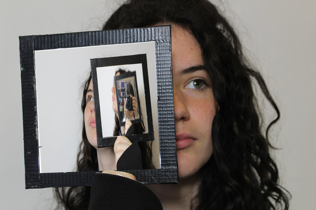
Reflection
In this task we were asked to show images through reflection so that we can successfully show the difference between a background and the focus of the image. To do this around school, I found interesting things that I would focus on: such as a wilting flower and a piece of art and reflected it by placing the small mirror in front of the focus at different angles to experiment.
WWW: I liked that the subjects I chose contrasted with he background.
EBI: What I didn't like about this was that the mirror was at an angle so some of the images looked out of frame and out of place.
EBI: What I didn't like about this was that the mirror was at an angle so some of the images looked out of frame and out of place.


Gallery Visit:
|
Over the holidays I visited the photographer's gallery in Central London. At the time that I went, the exhibition was a collection called 'How to Win at Photography'. This project encourages the audience to focus on the playful aspects of visual culture. In this exhibition there were many devices used to bring in the audience. One example of this was an interactive game. Another example is the use of exciting props, such as a vintage chess set in the middle of a room, filled with images of a cafe with customers playing chess with one another.
|

|
Environments:
Development One:
|
Sebastian Magani's work:
|
For our development piece, we had to choose a photographer to integrate our independent work into. I chose Sebastien Magani who is famous for his collection of reflection images. For this piece I imitated parts of his work - using branches of trees to contrast with the natural surroundings). I did this in Forty Hall, I also used the mirror to reflect the water which had already reflected the surroundings. I thought the key part of this was to capture the image in the mirror and make sure it did not clearly display the background.
WWW: The angles and brightness of some images were good. I did like this piece because my work did show inspiration from Magani's own work. EBI: In most of the lake pictures the camera wasn't in focus and the mirror looked odd and out of place. I also thought that my pictures were too repetitive, they were mostly all in the same angle with he same trees being reflected. |


My work outside of school:
Development two:
Stefan Rajek's work:
|
|
For my second piece, I chose Stefan Rajek who is well known for his monotone reflection pieces. For this piece, instead of using two different models: one in the frame holding the mirror and the other out of the frame being reflected into the shot, I used one model in various poses. I then layered the images to create an infinity tunnel effect - this is something I added from my inspiration of Stefan Rajek's work.
WWW: I think that the outcome did look like my inspiration, regardless of the colour of the image. EBI: The images in the mirror weren't distorted and looked more realistic. Overall, I don't really like this piece. I feel that I could have done better to make it look much more realistic. |


Development Three:
Kaleidescope:


I used the images on the left as inspiration. I did not have a photographer that I was inspired by. Instead I was more focused on the type of photography. For this piece I took the idea from my last development of using a mirror and a face. I did this kaleidoscope effect by using a kaleidoscope lens and experimenting with different angles and different lighting. What I didn't like about this piece was that my lens was too big so I couldn't fully capture my intended photo style.
WWW: I liked that my images were a representation of my inspiration. From this piece, I also liked that my work related to Magani's with the two images through one mirror - even though my work showed a piece of one person.
Next time, I would use the correct size lens to fully show my inspiration
WWW: I liked that my images were a representation of my inspiration. From this piece, I also liked that my work related to Magani's with the two images through one mirror - even though my work showed a piece of one person.
Next time, I would use the correct size lens to fully show my inspiration
My pictures:
Environments Final Piece
For my final piece, I intended to show both the artificial world and the natural world clashing. In my first piece, on the far right I edited my original picture I took in Highgate Woods and used a smaller image of a city from google. First I edited my initial photo and changed the saturation and vibrance to make it look more brighter in the final product. Then I copy and pasted both images onto the same layer. After turning the opacity of the image to 42%, I blended the image to my desired level of both images showing. I liked that my piece reflected other artists' in the environments page, such as Magani and Romain Jacquet-Lagreze as i used the urban city and the tension of nature showing through (which is similar to Jacquet-Lagreze's work), and also Magani because of the idea that you can see two images of nature in one. Although, I would have liked this piece better if I could have incorporated a Kaleidescope lens to this. Yet, I feel that it could have taken away from the clearness of the image.
