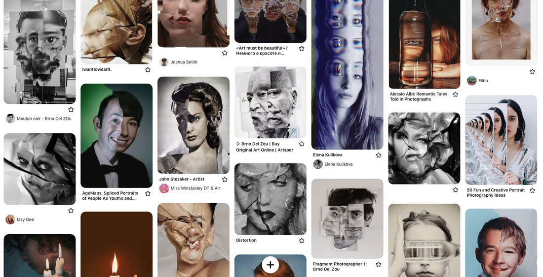
fragment
noun
plural noun: fragments
/ˈfraɡm(ə)nt/
noun
plural noun: fragments
/ˈfraɡm(ə)nt/
- a small part broken off or separated from something.
"small fragments of pottery" - an isolated or incomplete part of something.
"Nathan remembered fragments of the conversation" - verb
- 3rd person present: fragments
/fraɡˈmɛnt/ - break or cause to break into fragments.
"Lough Erne fragmented into a series of lakes"
Luke Stephenson
|
|
Luke was born on New Years day, 1983 in Darlington, North East England.
Life in Britain and the British psyche are at the core of Lukes work. He photographs what to many epitomises the eccentricity of Britain. Often humorous in their outlook, his series range from prize budgerigars to the World Beard and Moustache Championships. Whether animate or inanimate objects, Stephenson creates affectionate portraits of his subjects and documents worlds often hidden from the mainstream. He graduated in 2005 and has worked as a freelance photographer since. The same year he was awarded the Jerwood Photography Prize and in 2006 was selected as one of ten photographers to showcase their work at the International Festival of Fashion and Photography at Hyeres, France. His work has been published in a variety of publications including The New York Times Magazine, The Guardian, Dazed & Confused, Foam, Art Review and Wallpaper. Luke has published four photo books to date, his first was a series of Show Birds published in 2012 and the second published in 2014 is a series exploring the wonderful world of the 99 ice cream. In 2019 he published a book looking at the beautiful English Rose from the esteemed grower David Austin. Most recently British Record Fish published in 2021 the book explored the most popular participation sport in the UK documenting the 31 active fresh water fish records from the UK. |
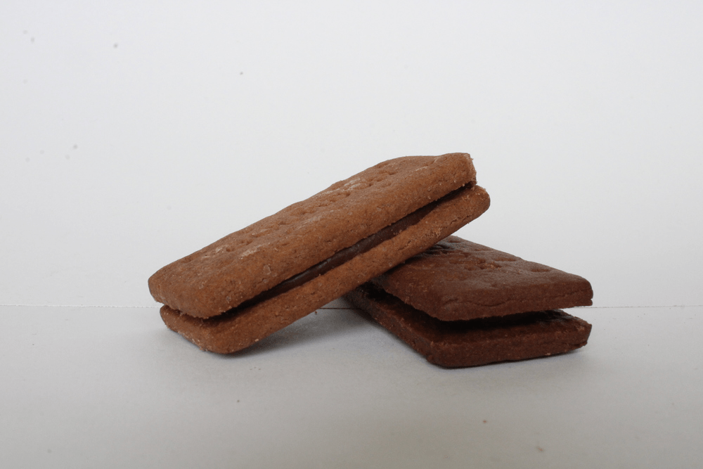
We used our knowledge of light and food from ordinary to extraordinary to incorporate our own take on Luke Staphenson's work,. To do this we took a bite from the biscuit and had to skilfully put it back in the exact place. In this GIF, there is a biscuit which has slowly eroded over time, making the viewer understand the biscuit has been eaten over time. Also, the lighting in this complication is quite bright, skilfully emphasising the erosion of the object, this creates a much more dramatic effect. The all-white background helps make the image more visible as it brings the features into the viewer's eye line. In photoshop, I increased the contrast a little bit so that the crumbs were a bit more defined, I didn't want to increase it too much because then the biscuit would have been too defined and not pleasant for the viewer to see. After this I selected all of my images and put them into gifmaker.me and then downloaded the calibration. I chose the speed of the GIF. I do like this complication, I think that when we made this it was quite hard because we had to carefully place the biscuit in the place it was before so I think that because this was done quite well I am pleased with the GIF. Although, it would have been even better if we had a tripod so that the movement of the camera was still.
|
|


Form over Function: Andre Kertesz
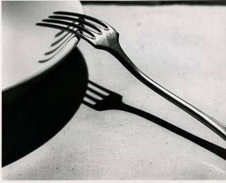
Fork Shadows
|
Andre Kertesz is a Hungarian born photographer, known for his groundbreaking contributions to photography. He states that he was shaped by constructivism and surrealism. His most famous photograph is the La Fouchette (1928), because of its perfect opportunity to mediate on strong composition and what makes it so. This relates back to Toolkit, when learnt composition through featuring everyday objects and fabricating them through a composition. I found that his black and white images emphasised this. |
My Work:
In this picture there are a series of forks portraying different shadows, in various different positions; next to each other, opposite each other, on top of each other. I like how the lighting is only bright on one side and darker on the other which creates a more emphasised portrait of the shadows and the magnitude of them as well. The very monotonous picture really does show a serious and intense picture, it also makes the images more visible and enhances the features of both the shadows and the forks. In photoshop, I went to adjustments, then I went to the black and white selection. After this I decreased the redness in the image to create a more black and white effect whilst keeping the other colours the same. As well as this I increased the brightness just a little bit to make the image more defined and portray the image as more intense and serious to the viewer. I really like this collection of images because I think that they were very focused and this contributed to the mood of the image. As well as this, it is also really simple but effective composition of shadows and the different shapes they can make. What went well in this collection was the really clear and focus of the image. The only thing I would improve on next time would be using other objects in addition to forks and further experiment.


In this GIF there is a complication of a fork and its various shadows, as the lighting moves, so does the fork. This adds to the effect of lighting as the lighting in this is quite dark, emphasising the shadow and the fork. As well as this, the lighting we used was from a green torch, creating a warm, welcoming tone in the picture. Because the lighting is quite dark, like in the previous collection inspired by Andre Kertesz, it creates a serious and intense atmosphere within the picture. To create this, we set the lighting up and moved it slightly, photographing in just one position. I then put this into gifmaker and chose a slower speed to allow the viewer to properly understand the effects of the lighting. However, I don't really like this piece of work. i feel that the contrast of the fork, the shadow, and the lighting wasn't that emphasised. I also feel that the image wasn't very focused like the collection just before. Therefore, I don' t really like this piece and something I would do next time is use a white shadow as I feel it is more natural and allows for a truly distinguished contrast.

|
|
Edward Weston
|
|
Edward Weston was a 20th century American photographer born in Illinois. He later died in California in 1958. He shaped photography today after he pioneered a modernist style characterised by the use of a large-format camera to create sharply focused and richly detailed black-and-white photographs.
Some of Edward Weston’s most famous work was close-up images of vegetables and fruit, photographed in a way that captured the “essence” of the object, taking them out of context. His manipulation of light to highlight shape, texture and form helped bring photography out of the shadow of painting and stand on it’s own as a credible art form. Through these photographs he transformed his subjects into abstractions of shapes and patterns |


In this collection of images, the images are photographed at a close up with a very high focus, as well as this the images are taken of objects and foods with texture. For example, the lettuce leaves and the brightness hitting onto them creates a sense of detail and tranquility. Furthermore, the use of lighting and brightness to portray texture adds onto Edward Weston's richly detailed images. However, I found that when i put my images in black and white, they became less contrasted and therefore did not look as pleasant to the eye than if they were just left with the colour. This influenced my decision to leave them in colour. As well as this, I really liked the images with a contrast of lighting such as the pineapple image,. I thought this was really effective in showing the prickly texture of a pineapple as the image begins as really light on the left hand side but then progressively gets darker, implying that the pineapple begins as a soft and warm fruit but gets pricklier and pricklier. In addition, images such as the pepper picture with the bright light show the texture of a worn out vegetable, I really really liked the use of light to show texture and tell a story through the images. I also really liked the fact that all of the images have either a black or white background which really emphasises the colour and texture within the images themselves. To create these images, I got really close to them and used lots of lighting, I then increased the brightness and contrast in photoshop to emphasise these already bright images. I think this is one of my favourite collections as I think that the images were really focused which made them have a far greater definition, which creates a fun, yet intense mood. Although, next time i would use a lot less light so that i could attempt to perfect these images in black and white, just like Edward Weston.
Lauren Marek and Chad Pitman
|
|
In his series people in progress Chad Pitman takes images that show different parts of a person. In this work he breaks up a person into different parts and focuses on different sections of a persons face and body. By taking the images individually the parts are given new meaning and encourage the viewer to look more closely at the textures shapes and colours that make up a person. Lauren Marek in her series "Pieces" create's similar work but her work focuses even closer to the person and creates an even more abstract representation of the figure. Inspired by Picasso and his cubism portraits she uses 9 images alongside each other to create her abstract representations of a person.
|


in this collection, inspired by Lauren, Marek and shit Chad Pitman, an abstract representation of the figure in total There are nine images in a grid, each image portrays different part of the figure. For example, the top three images include the eye, ear, and hand, the lighting in all of these is especially bright to portray the definition of each and every feature. The emotion fits in with the white background and the serious tone of the features adds a magnitude of definition. This makes the image look very intense and serious. It also makes the image stand out because of the lighting and the features being more visible. In Photoshop, I did increase the brightness, but lower the contrast to add emphasis to this.
Geometric Portraits
Gordin Magnin:
|
|
Gordon Magnin is a Nevadan artist who works in photography, scans, collages and altered found images. He uses fashion pieces and uses them to make his geometric patterns. Furthermore, his use of black and white accentuates the geometric patterns to the eye. Magnin's aim is to break down the industry's idea of perfect looking models and to challenge their perception of beauty. He believes his work is "intricate, geometric, precise and destruction", despite this, his interest lies in using geometry and pattern to challenge the intended objective, interpretation and significance of consumer based images. I like how his work of geometric patterns shows both a distorted but clear image. I think that this technique is effective in his intentions of the images. The use of shapes with sharp edges, such as the square, highlights the composition by contrasting with the light background. |


My work:


|
For this task we had to take shapes using the polygonal tool from the original picture and then copy and paste them onto the picture various times. With these shapes, we rotated and enlarged them to create an effect similar to Gordin Magnin's work. However, I don't really like these images because I feel that they don't represent Gordin Magnin's style. This is probably because the shapes I copy and pasted didn't form a pattern, as I didn't put them over each other and shrink or enlarge them. Furthermore, I think that my pictures would have been better in colour whereas Gordin Magnin uses black and white filters to enhance the distorted shapes. in this image you can see a section of the shape rotated and made to a smaller scale. i also like the use of light in the image, there is very minimal yet subtle light and this helps the viewer understand the contrast and the tone of the image. To do this image, i first increased the contrast and brightness just so there would be more defined features when I rotated the section of the image. I then used the elliptical tool to carve out a piece of the image. By using copy and paste i was able to have nine layers, i then used free transform to adjust each and every individual layer. I really like this image, although it doesn't fully represent the artists' work, I still feel that i put my own spin on it, showcasing the image as serious but also fun and joyous. In the second image, there is a picture of an eye which has been layered an rotated to see a spiral. I did this by copying and pasting a layer and then rotating it in free transform, in total i had 19 layers, then i flattened the image. I don't really like the second picture, I feel as though it is messy and disorganised, it doesn't really represent the artists work. I think with this project the thing that went well was the use of enlargement and scale factors and use of rotation to show some linking towards the artist. However, next time I would not do any spirals or have my own spin on it but just copy the artist in their use of pentagons and hexagons and instead of layering them and rotating them i would just flip them.
|
Alma Haser
|
|
Cosmic surgery is imagined as a medical procedure that people can choose in the not so distant future for aesthetic enhancement, mood alteration, and to thwart increasingly pervasive methods of surveillance. Combining photography with collage and origami, Haser's playfully odd portraits consider the link between identity and image in a culture of visual bombardment. She suggests a fundamental shift in the way we understand ourselves and the world around us, picturing the possibility of a trans-humanist future. She grew up in Germany, and with both parents as full time artists, Haser was brought up around art and creativity. |
My work:
I liked these images because I feel that they truly represent Alma Haser's intention of combing origami and photography to show a link between identity and image, to me, they linked to her work even though I experimented with different angles and perspectives. In this picture, you can see a large a3 image with the exact same image on top of it, just in origami form. The lighting in this picture is good, although it could have been better used to enhance the features of the origami and the distortion within the face. However I do feel as though the black and white in the image does already enhance some of this, although it looks quite grainy. To create an image like this, i used a model plan for my origami and cut it out on the back of my chosen image on a4 paper. I then carefully cut out little tabs which helped me massively and allowed me to put the origami together. I then placed the origami figure on top of the chosen image and proceeded to turn it every so often so i could have a range of images. I liked that the origami distorted the face, and i liked the use of physical photography, this also helped create a tense atmosphere within the figure of the face and truly did enhance the facial features for the viewers to see. This wasn't one of my favourite pieces as i felt as though the box could have been neater although i did like that you could actually see the definiftion in the model's face through the origami.
Chris Killip
|
|
Chris Killip's continued efforts to value and document the lives of those affected by the economic shifts in the North of England, throughout the 1970s and 80s, have made him one of the most influential figures of British Photography.
This retrospective exhibition of more than 150 works, serves as the most comprehensive survey of the photographer's work to date and includes previously unseen ephemera and colour works. Shot on a 5x4 large-format camera, Killip’s images for In Flagrante captured the plight of working-class communities who had suffered from the devastating effects of deindustrialisation. Poetic, penetrating, and often heartbreaking, Chris Killip's In Flagrante remains the most important photobook to document the devastating impact of deindustrialization on working-class communities in northern England in the 1970s and 1980s. |


Fragmented Buildings:
Patrick Cornillet
|
|
Patrick Cornillet is a painter, not a photographer. In this series he has painted architectural elements isolated from their environment and reconstituted in the form of objects on a white background. Patrick Cornillet is a French architectural painter born in 1968 in France. Cornillet resides and works in Nantes.
His recent work features austere constructions in empty surroundings. Fragments of architecture left in the center of the painting, in suspense by its visitors. His works capture their spectators in an illusory space. Because of this the viewer struggles to give an interpretation to these concrete structures. Unclear is if these structures have ever served a purpose other than confusing its viewers. |


Fragmented Buildings Homework:
In this collection you can see cutouts of important parts of architecture, for example, a roof, some doors. I did this in the style of Patrick Cornillet. The lighting was dark to emphasise a contrast between the natural and artificial, enhancing the fragments between both. To create this image, I used the polygonal tool to select a key part of the image and then pasted it onto a white background. I really dislike this series, the pictures weren't bright, or focused which i think really impacted on my images. However i did like the use of photography to combine architecture and nature. I found that my series were quite messy and rushed, there wasn't really a definition of certain architectural features
Daniel Crooks
|
|
Daniels Crooks is a sculptor, photographer and time based artist. His work creates slippages between visual perception and temporal experience. Collating fragments of movement in his video works, Crooks poses a question of the metaphysics of the image and reality. Often this results in mesmorizing panoramas suspended in time, while his portraits destabilise their subject by splicing together multiple narratives.
Born in Hastings, New Zealand, Crooks graduated from the Auckland Institue of Technology. Crooks has exhibited prolifically throughout New Zealand, Australia, Korea, Peru and Singapore. He has participated in the 17th Biennale of Sydney in 2010, and Figuring Landscape at the Tate Modern in London. He has also won numerous awards including the inaugural Prudential Eye Award 2014, Singapore, and the Ian Potter Moving Image Commission 2014, Australia. |


My Work:
For this piece, I took inspiration from Daniel Crooks. However, instead of using time to show a distorted image, I cut a still image into many strips of paper and made sure to rearrange them so the image could still be understandable, just a bit distorted. I only liked one image out of the final three, this was because I felt that the first two were too repetitive. To me, the third picture shows a distorted London, but the first two just show two strips of paper repeated again and again. I felt like it didn't clearly represent Daniel Crooks' work. In this image you can see various landmarks i took over a course of three days, all distorted. I distorted them and took inspiration of daniel crooks. These images had great lighting and were really defined which i think added to the overall outcome of the images. I do think that the frayed edges on the second picture added texture and allowed the viewer to understand that some parts of this image are meant to be viewed with an intense atmosphere at hand. I really liked how the images were clear and that you could clearly see what the orignal image was, even through distortion. Although, I do think it would have been better if they had been cut up into smaller strips so that they could truly represent Daniel Crooks' work.


Eyes:
My Inspiration:


The original pictures:
My Work:
For this piece, I wanted to do something similar tot he inspiration pictures. However, this time I experimented with eye shape and so used my dog, who does not have a similar eye shape to the inspiration pictures . By doing this, the task became harder as she has a much larger iris, as well as this, the colour of the iris was extremely dark so I could not decrease the opacity much. Instead, I cut out the shape I wanted with the Magnetic Lasso, put the intended image behind the layer and then neatened it up with the history tool. I found this worked better than decreasing the opacity and showing an object, such as the goldfish inspiration photo. The only limitations of this were that I could only show scenery, not objects. In the first picture you can clearly see a dog eye with the pupil a forceful wave, here in this image the lighting is bright and clearly defines the dogs fur pattern which is a warm colour, by adding a bit of vibrance and saturation to this image i was bale to make it more welcoming and inviting to the viewer. The use of the wave behind this layer contributes to the contrast between light and dark, warm and cold. I really liked this image, I think that my use of using the polygonal tool to cut out the layer was quite good as it was very had to get a neat depiction of this as the eye is an odd shape. Next time, i would try to be a bit neater. In the second image you can clearly see another dog eye which has a moon in its pupil. Although i did like this image i felt that the first on was much better, i just thought it flowed much more nicely. In the third paragraph, you can see a dogs eye with a black and white forest in the pupil. Like the first image, i think thus image also represented a contrast between cold and warm, light and dark. This was one of my favourite images as the photos looked very similar to their inspiration photos. However, i would have liked these images much more if the final outcomes were much much neater.


My Work:
David Samuel Stern
|
|
David Samuel Stern demonstrates that weaving can encompass more than the interlacing of simple threads and tactile fabrics. This ancient craft can also be used to design dynamic and thought-provoking images. “I’m an artist and photographer, and I also teach photography,” Stern states when introducing himself. “For the last several years, I’ve focused mainly on making portraits. I live and work in New York. I’ve had many kinds of jobs, and I studied art history and photography while I was in school.” For his Woven Portraits series, the artist creates portraits that can be viewed from multiple perspectives. In other words, he’s able to show viewers different sides of the same person by combining artisanal weaving and portraiture. “Most photographs, even printed, are not described as physical objects,” Stern said, “I would describe the Woven Portraits as photographs that are also objects. And, to me, one of their most interesting aspects is the texture that comes from the weave, which gives them a kind of rhythm. Because of this emphasis on their physicality, they are somewhat abstract depictions of the people they portray.”Since an individual’s personality is comprised of many facets, the photographer’s portraits help to reflect this multidimensional nature. “The Woven Portraits come from my preoccupation with portraiture and with the nature of images themselves,” he explains. “We have high expectations for what portraits and images—specifically photographic images—can do. We invest them with so much meaning. Photographic portraits ‘capture’ the person they portray and present him or her to us as a declarative once-and-for-all. I wanted to make portraits that find a way around this.”
|


My Work:
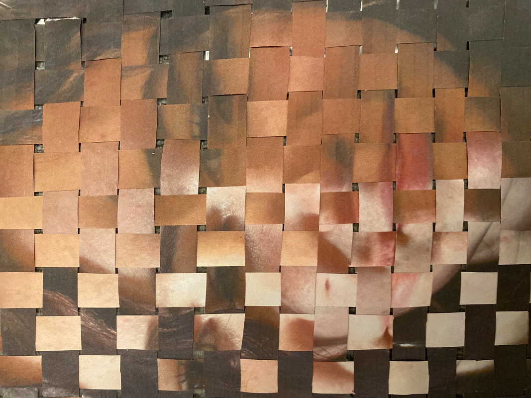
In this image you can clearly see a neat and intricate weaving of an image. The lighting in both images were darker which contrasted with each others features. Although the final outcome looked quite dark and messy. I thought that the intricacy of this image could represent how delicate humans are. To create this image, i cut up both images into very small strips. I then labelled the backs with different sequences so none of them would be confused as the other. I then started weaving and once my first few were done i stuck tape on the back to make sure they stuck and would not undo. Althougb, this failed and the base of my weave fell apart after about five strips, therefore i had to cut the side of the picture in an attempt to make it neater, only for it to look messier and much more long and disproportionate.
Rosanna Jones
|
|
Rosanna Jones is a photographer and mixed media image maker based in London. She is a graduate in Fashion Photography from Falmouth University. Her work specialises in an experimental blend of art and photography; celebrating the physical possibilities of an image, rather than simply its two dimensional form. Her trademark aesthetic has been built through years of painting over, ripping up, burning and otherwise distressing her photography to create tactile portraits that defy the flat images they once were.
|


My Work:


In these pictures you can see three distorted faces, all having fragments of their features. In these images, the lighting is alright but i think the real contrast comes from the plain all black background. These images show emotion through their distortion, creating a very serious and quiet atmosphere. To create these images I used a single cut out of a face and glue as well as the plain black card. i cut up various features of the face and in some instances like the third image i used the leftover cutouts to create the face, mirroring rosanna joneses work but also putting my own spin on this project. I then arranged the images and used pva glue to stick them down. However, when i did stick them down i found the glue went everywhere and i ended up with the images having splashes of colour due to the colouring of the glue. i did not really like this and i fi could do this again i would use a different glue or used an alternative method to stick these images down so i do not encounter the same problem. However, one thing i do like about this collection is that they do represent rosanna joneses work and truly do represent the possibilities in physical anatomy, just like rosanna jones wanted her own images to. Although I only like two of the images, I think the third one is too messy and has a lot of gaps which is not pleasant to the viewer.
Merve Özaslan
|
|
Born in Istanbul, graduated from Mimar Sinan Fine Arts University as an ceramic artist in 2010. She has been working on collage projects since 2012. Özaslan’s use of black and white vintage photographs leads the viewer to a sense of nostalgia and questioning the value of progress. The photographs further serve to contrast the nature based imagery, and to enhance the colours, signalling the value the artist places in nature. The process of finding the right image can take days or weeks for the artist, “but when I find the right photo, the collage directly takes a shape in my mind. The rest is about getting that image from my head to real life”. |


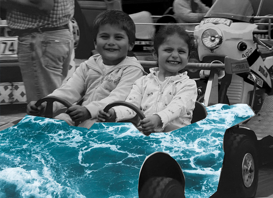
|

|
In these two images you can see two childhood images, adjusted to black and white to represent vintage images. As well as this, the images have been cut out and layered on top of a colourful wave, influenced by Merve Ozaslan's work. You can't really see the lighting in this image, but in photoshop i did turn the contrast up and the brightness down just so that the contrast between the wave and the rest of the image would be enhanced. i also made this image black and white and turned the level of red saturation in this image down to about 40%, i also slightly tweaked the yellow in this image as well just to have the same affect. I used the polygonal tool to draw around the objects in these images, such as the slide and the race car, I really did like the outcome of the racec car however i feel like it could have been much much beater around the tyres. On the image with the slide, i really liked the emphasis of childhood as well as fragments of age tying in, allowing the viewer to see a power balance between the two themes. To create these images, I found old childhood images, then i scanned them and cut out the shapes i wanted with the polygonal tool, i then placed these two layers of the wave and the image and flattened it. I really do like this collection. I think that the contrast has hints of warm and cold, fragments of childhood and adulthood, light and dark.
