CHANGE
Pinterest
Vilde Rolfsen
|
Vilde Rolfsen is a fine art photographer based in Oslo. Her series “Plastic Bag Landscapes” addresses the detrimental effects of plastic waste to our land and our oceans. While highlighting the abstract beauty of discarded bags found on Oslo’s streets by exposing them from a macroscopic perspective, Rolfsen also hopes her work will remind viewers to look more closely at their own consumption patterns. Her practice is based around human obsession with objects , and the relationship with them. Since she started her practice she has been observing how people relate to objects it’s these observations she is trying to explore in her photographs. What started as an obsession for objects has now grown into an interest for the object itself and an obsession for taking photos of them. By choosing familiar objects that most people can relate to, Vilde creates art that can be understood and interpreted on several levels and by most people. For the project “Plastic Bag Landscapes she uses plastic bags in the street. By using light different coloured cardboard Vilde plays with perspective. When the studio lights hits the plastic and the colours shine through, the plastic bag does not look like a plastic bag anymore, but they look like an imaginary landscape.
|
|


|
|
This collection is one that i greatly dislike, clearly the images don't reflect the work of the artist, and on one of the images you can really see where i used the flash above the bag to create the 'mountain/natural' effect. I also can't really see where the theme of change comes in, although one could argue that the perspective change of seeing inside of the bag is a reflection of change. This is really interesting as this is how Vilde Rolfsen wanted his work to be perceived, and maybe the imaginary landscape in the bag could represent our perspective of change from reality. The dimensions of colour were quite good in this collection however, and the focus was quite good too, and i certainly did learn from the rule of thirds we did in toolkit, and i think this really did accentuate the lighting in this image.
|


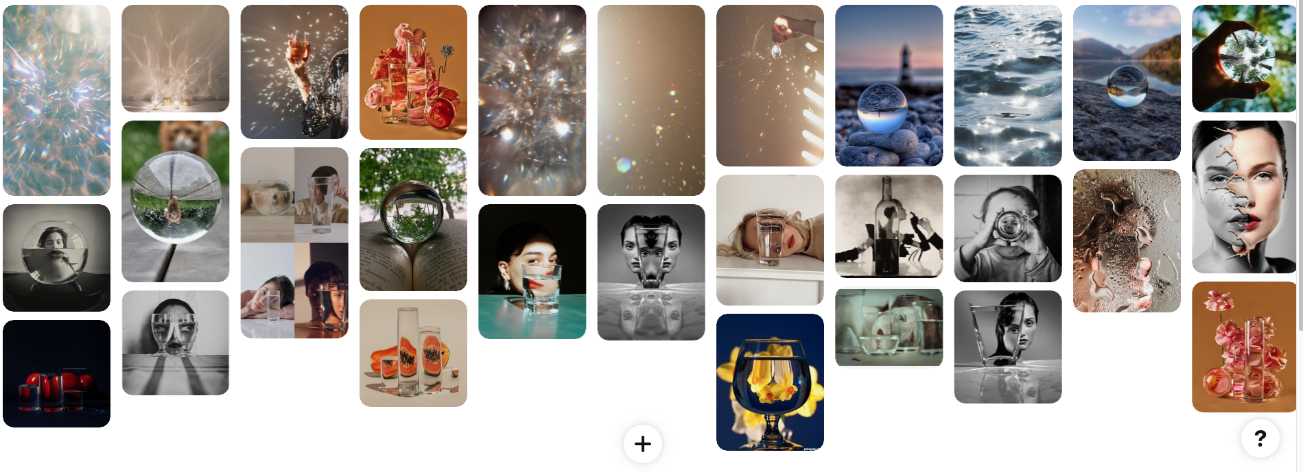
Suzanne Saroff
|
|
For this piece, I placed fruits behind glasses of water at first I tried this with different coloured glasses but the image was not reflected in the water. I do think that this piece truly reflected suzanne saroff's work. I really disliked this piece as I felt the glasses were uneven, the lighting didn't make the images brighter Also, the lighting did not help achieve the bold colours i was trying to achieve and instead made the collection look incredibly dull and juvenile. Although I did not feel that this collection achieved the level of distortion that saroff achieved and instead was extremely hard to achieve such results. I went in to this composition believing it would be quite easy but actually it was quite challenging and switching the. glasses to show the distortion was really hard.
|


|
Suzanne Saroff combines commonplace objects with different tools, techniques and colours to create alternative avenues of perception and expression. Suzanne uses refraction, bold colours and directional light to achieve such results. The alternating of size, shape and position of these water-filled vessels provide endless compositions. Images play with light and shadow, appearing fractured, divided into several parts, shrinking and incredibly distorted. Photographer Suzanne Saroff started photographing the classic way: she got hooked to her disposable camera and shot everything she liked. She wanted to teach herself everything about photography, lightning and the right composition. Compositions became more and more important, up to the point she found her true fit, which she is well-known for now: putting glasses filled with water in front of objects. From lobsters to flowers, everything gets this magical touch and new perspective.
|
|


|
|
I tried to incorporate Saroff's technique, and instead did the fruit collection, just with my brother
|


|
For this development, I chose to do the previous development and instead recreate it with colour. I used coloured bulbs and took these pictures with only one lamp in the darkness. This project was quite frustrating as some colours, for example the blue bulb, made an odd colouration on the camera (the blue became purple), an some colours, such as the pink did not brighten the mage, which in turn did not show the true effect of the water distortion. I partly wish i took these images in a different location because you can clearly see that there isn't a clear background.
|
|


|
|
For this collection, I used inspiration from Coppi Barbieri, as well as using inspiration form the previous project with the coloured bulbs. I do like this piece
|


Coloured crystals
|
For this collection, my aim was to reflect shards of colours on crystals. I attempted to do this with coloured bulbs which i had used on the three previous projects. I really really liked this piece and especially liked the focus on the individual shards of the crystal, creating an almost hot air ballon effect. The different colours on the crystals and the lighting was quite a variety especially with the varying colours. my aim for this piece was to show shards of glass and colour, the focus on this collection was especially good. I was almost going to pick this for my final piece, although I felt the images were too static and immobile to represent change which to me, is all about movement within change.
|
|


Coppi Barbieri
|
|
Lucilla Barbieri and Fabrizio Coppi form the still life photographic team Coppi Barbieri.They started their collaboration in 1991 in Milan. They were one of the first duos to form a continuous and solid collaboration in photography. Based in London since 1996 they have realized projects in different parts of the world from New York to Rio, Paris, Tokyo, Milan and Arizona.They started as Interiors photographers, then brought their elegant vision in different fields: Jewelry, Fashion Still Life, Beauty and Car photography. Their work has been published in magazines such as L’Uomo, Vogue, Italian Vogue, Nippon, GQ, New York Times, T magazine, V magazine, Wallpaper*, W, World of Interiors and Grey magazine. Coppi Barbieri’s work was exhibited in the show ‘Weird beauty in fashion’ at the International Center of Photography in New York City in 2009. As well as their commissioned projects, they continue with personal research on different subjects and recently produced a series of close-ups of birds and another of broken glass objects. They like to describe their vision as naturalistic and always find inspiration in nature.
|


FINAL PIECE
Method:


FINAL PIECE:
In this collection, I tried to use my past projects on glass and light as inspiration for this piece, although I took the idea of broken glass, I chose not to add colour and instead used flash on a phone in a dim room to take this collection. I did add water to the glass shards to reflect water droplets, and although the droplets didn’t properly reflect, I still liked the effect the water made. In this collection, the use of light adds to the images. As well as this, I didn’t find it as hard to take these images as past projects did, and I really like this collection as in my opinion it certainly represents change, the water droplets and the reflections represent movement which could be seen as synonymous as change. I did use inspiration from Coppi Barbieri and I do feel as though this collection does truly represent Team Barbieri's work. I like how the shadows are also jagged, perhaps demonstrating a lack of smoothness. I really like how the glass was extremely delicate but was very jagged and looked extremely rough and sharp and yet the lighting makes the image look soft, and also how the reflected shadows aren't as jagged or rough. I also really like how the lack of colour and the monotonous nature of the images show a simplistic response to change. One could also argue that change represented in this image is through the change of the jagged images and the soft reflections.
